Material Design
by Hadrian Ang
Last June, Google held their annual developer conference called “Google I/O”. During the conference, numerous announcements were made about new Google services and products, such as Android L, Android Wear, and Android TV; though none were as universal as Google’s new design philosophy dubbed “Material Design,” which will be applied across all of Google’s services.
What It Is All About
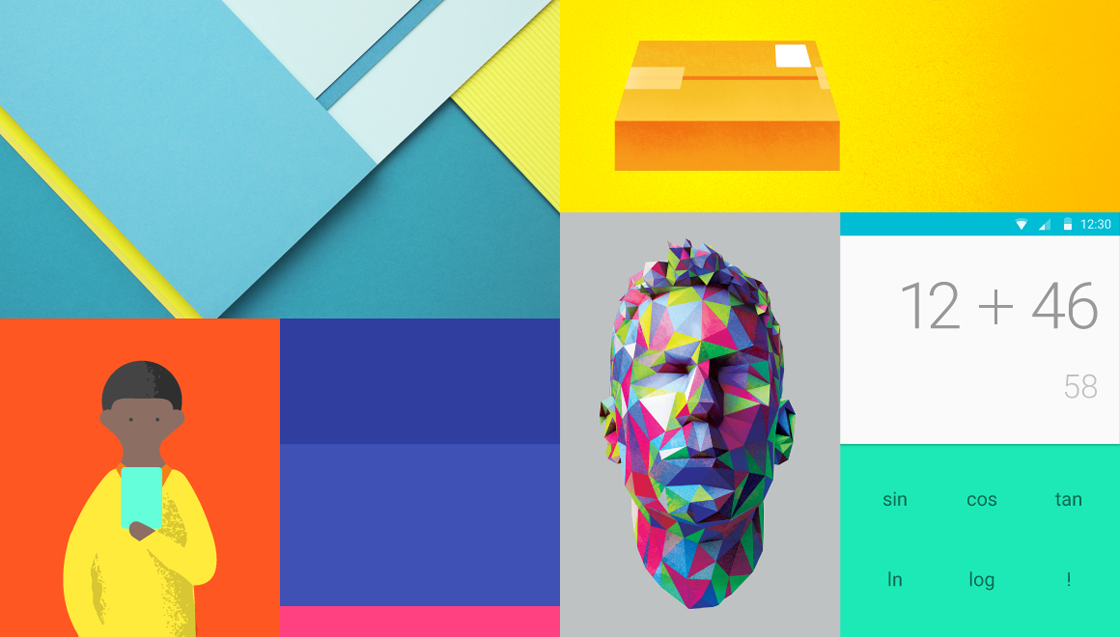
Material Design is a visual language that looks at the very roots of what software is made of, paying particular attention to the unification of good design and fundamental physical properties as it seeks to “define the underlying physics of our interfaces” (Developers, 2014).
It is no surprise then that the design philosophy focuses on what is physical, such as the fundamentals of light, surfaces, movement and energy.
Bold colors and a refreshed Roboto font bring about a cleaner look, while animations ensure visual continuity without being over-the-top. The interface as a whole thus designates the user as “the prime mover”, ensuring that the flow of energy is derived from the user’s actions. As a whole, the interface truly makes the user feel in control of the device, instead of being confused by it. Though only previews, the images presented by Google look promising, as Material Design seems to bring fresh ways of using Google devices and services.

Image from:http://www.google.com/design/spec/style/typography.html#typography-standard-styles
Moving Forward
The importance of Material Design cannot be overstated. With Apple’s recent redesign of iOS and Microsoft’s improved Windows Phone 8.1, Google needs a design refresh if it wants Android to remain at the top of the OS market share. More importantly though, Google is following the recent trend of unified design philosophies across devices. With Mac OS X looking more like iOS and Windows 8 looking more like Windows Phone, it is about time that Google create a unified design language to improve UI consistency across multiple devices and form factors.
Moving forward, this more unified look between Google Apps, Chrome OS, Chrome, Android, and other Google products should strengthen the Google ecosystem. Integral to this approach is Material Design’s compatibility with a wide array of devices and screen sizes from Smart TVs to smartphones; it manages to look good on a 10.1 inch screen as well as a 5 inch screen.
Material Design will push Google’s services into the future and will put it head-to-head with Microsoft’s Modern UI (which also looks good on different screens and devices), and Apple’s recently redesigned interfaces. All we have right now are previews though, and only actual user experience will decide the better design.
Sources
Developers, G. (2014). Google I/O 2014 – Material design principles. Retrieved 2014, from https://www.youtube.com/watch?v=isYZXwaP3Q4
Google. (2014). Material Design. Retrieved from Google: http://www.google.com/design/spec/material-design/introduction.html#


Comments