Hello, Metro: A Quick Guide to Windows 8’s New GUI
NOTE FROM THE EDITOR-IN-CHIEF: Due to legal concerns, Microsoft is shifting away from the “Metro” moniker and now refers to the UI as “Windows 8-style UI.”
To many people, the classic Windows GUI is synonymous with the quintessential computing experience. While other platforms on the rise (such as OS X, iOS, Android, and Ubuntu) have presented new paradigms in user experience, pretty much anybody who knows how to use a mouse and keyboard knows how to navigate Microsoft’s timeless desktop GUI. For better or worse, however, all of that is about to change. The next version of Windows, aptly named Windows 8, has a new user-interface that is unlike anything else we have in the market today.
‘Metro’ is Microsoft’s re-imagining of the Windows experience, and apart from its implementation in Windows Phone, Microsoft’s mobile platform, this is uncharted territory for a desktop platform that has aesthetically remained unchanged for over 15 years! While the classic desktop is still present here (more on that later), Microsoft clearly sees Metro as the future of Windows, so it is very important that the company pulls this off correctly. So how did Microsoft’s attempt at a new look turn out?
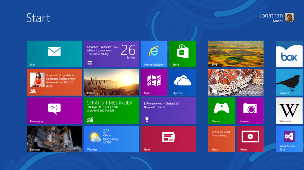
Booting into Windows 8, the Metro Start screen has replaced the classic Start menu as the main launcher for Windows applications. From an aesthetic standpoint, Metro is a true triumph for Microsoft. The main font, known as Segoe, hits an ideal balance of styling, elegance, and simplicity. The tiles, which double as both a widget and an icon, can show a good amount of information from the Start screen without becoming overwhelming to the user. One thing that doesn’t get as much attention in the press is Metro’s use of color. Microsoft’s choice of color palette for Windows 8 is surprisingly good; nearly every color option allows the UI to pop and feel lively, without ever feeling overblown and convoluted.
The minimalist presentation of Metro also continues into most built-in apps. An app almost never shows all menus and buttons at once, preferring to keep the UI clean by showing only a few items simultaneously. Also, unlike in classic Windows where different design languages often clash with each other (i.e. Classic Menus vs. Ribbon), every application in the Metro UI conforms to a single design language. This ideally means that a user is never forced to learn a new user-interface, shortcut, or gesture for every Metro app they download, since every application behaves in the same way.
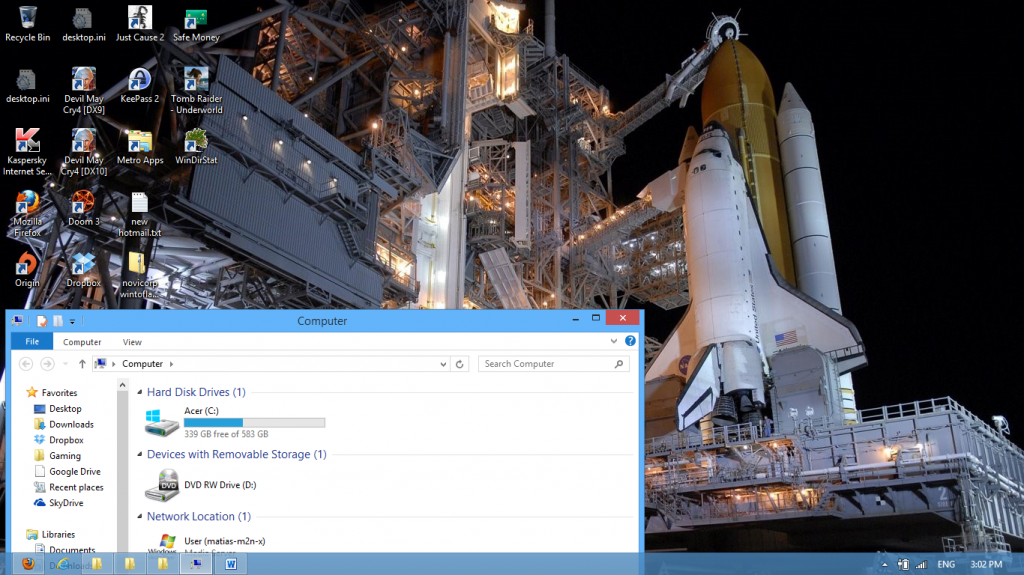
 What about the legacy apps and apps that do not conform to the Metro design? For those clamoring for these non-Metro apps, Microsoft still provides with Windows 8 the classic desktop GUI, where apps not Metro-styled (and therefore unavailable for download via the Windows Store) can still be installed. While the classic GUI remains mostly intact from the previous iteration, there are still some big differences from Windows 7. The first thing that you will notice is that the Start button is completely gone now. This means that you will have to get used to using activating the Start Screen (which replaces the classic Start menu) by either pressing the bottom-left corner of the screen, or pressing the Windows key. Another notable change is the look and feel of the windows themselves. The Aero UI, which debuted in Windows Vista, takes a backseat in Windows 8. The ‘glass’ borders are less translucent, round corners have been removed from the window borders, and overall there is far less gloss than previous iterations of Windows. In all, it is a cleaner, less gimmicky look for the desktop, though it will take a while to get used to if you’ve been living with Aero for a long time.
Those were the new things that general consumers can expect in the upcoming version of Windows, but what about the power users? Are there any new things added that could speed-up productivity, or were features removed in the name of design and ease-of-use? There is some good news and some bad news. The good news is that Microsoft has added some additional features that would make hacks less necessary on the user’s part. For example, the task manager on the desktop allows fine-tuning of application activity without having to play with the registry or with configuration files. Another thing that long-time Windows users will appreciate is a super-easy way to perform spring cleaning on their computers. Whereas in previous of Windows a user is usually forced to wipe their disk clean if they want their machine to run good as new, Windows 8 now has the option to clean up system files while keeping personal data untouched. This means Windows 8 can clean itself up without the need to format the disk and reinstall the operating system, which can save a lot of time for users.
What’s the bad news? While Metro is certainly a triumph of design, and a step forward for Windows on touch devices, Metro isn’t exactly optimized for use on a mouse and keyboard, and for better or worse, this is where you will be spending most of your time in. The tiles themselves are large for a pointer as precise as the mouse, and because items are often hidden in a horizontal or vertical list, having to constantly scroll through the Metro interface becomes a necessity. While a classic desktop is certainly still here, its presence feels more like a back-up for legacy apps than it is a main feature of Windows moving forward. You may find yourself having difficulty working exclusively on the desktop, and constantly switching between UI styles might be jarring at times, but hopefully this problem will alleviate itself once more applications remove the need to be run on the desktop.
And that concludes our look into the new look of Windows 8. Metro is a bold new direction for the company, and the tile-based user interface holds a lot of potential for what PC usage can be like in the future. There is, however, still some work to be done. Design tweaks may still be required for Metro before it can be as easily used with a mouse and keyboard as the classic desktop, and Microsoft will have to continue to promote developing apps for Metro in order to prevent the user from having to switch between UI’s too often. Still, Metro is a promising enough new feature of Windows 8 for Microsoft to continue to invest more resources into making it better. Hopefully by the time Windows 8 reaches the release date, enough of the kinks have been worked out for Windows 8 to be a worthy evolutionary step in its 20+ year old history.


Comments